The University of Sydney - Cobbedee
Naming | Tagline | Brand Identity | MS Office Templates
Having worked with Creatik on previous research campaigns, the University of Sydney’s Institute of Agriculture approached us to develop the brand identity, naming, and templates for a farmer-owned cooperative launching a new hybrid wheat seed company. This initiative has the potential to transform wheat production in Australia and beyond.
The challenge? “Design a brand that every farmer will proudly wear on a trucker cap.” Challenge accepted.
During a collaborative brainstorming session, the University’s team suggested "Cobbedee"—a name with strong historical and geographical ties to Cobbitty, home to the University’s Plant Breeding Institute. The name reflects the cooperative’s farmer-led mission and deep Australian roots.
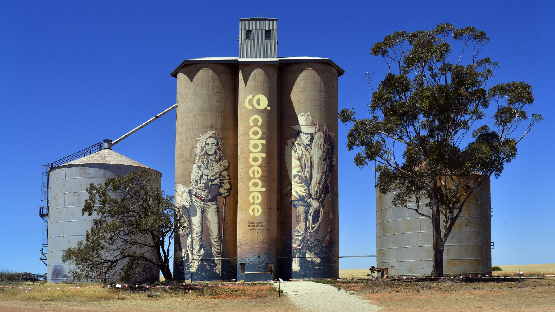
The CO. device became a defining brand element, integrating the "Co" from Cobbedee and Cooperative, while subtly nodding to a seed within the “O”. This device evolved into a shape language used across marketing materials, from image containers to crop-inspired patterns. A modern colour palette reinforces Cobbedee’s fresh approach to seed development, positioning it as a progressive, farmer-first brand that feels both trustworthy and forward-looking.
This project is more than a brand—it’s the foundation for a new era in wheat production.