Marble Money
Brand Identity | Brand Guidelines
Remara, an Australian-based asset management company, was establishing a new business offering bridging loans. They had a great name, Marble Money, an ambitious business strategy, and were seeking a bold brand identity to launch their brand into the market. They approached Creatik to create this brand identity.
The name draws a metaphor from the game of marbles, where constant movement mirrors the purpose of bridging loans—keeping financial transactions fluid and uninterrupted during transitions or gaps. This approachability contrasts with traditional financial institutions, adding a playful twist that distinguishes it in a serious market.
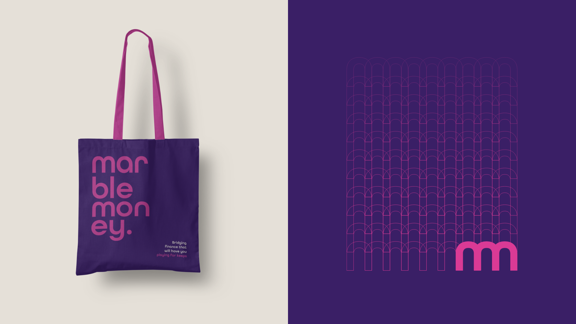
The brand identity features a friendly and approachable sans-serif wordmark characterised by flowing, rounded shapes and curves. The Marble Money graphic device is formed by combining two m glyphs, resulting in a unique icon. The colour palette is both vibrant and sophisticated, and the striking gradient within the design suggests a dynamic sense of movement and potential, reinforcing the brand's energetic and forward-looking ethos.
Awards and recognition
GOLD - Better Future Australian Design Awards 2025 - Identity and Branding, Finance
GOLD - Better Future World Design Awards 2025 - Identity and Branding, Finance
GOLD - Better Future Sydney Design Awards 2024 - Identity and Branding, Finance
GOLD - ANZ Transform Awards 2024 - Best Visual Identity Financial Services


