
New North
Naming | Brand Identity | Website | MS Office Suite
Our brief was to create a name for a new breed of regulatory economists that conveys confidence, leadership, expertise, and trust. The idea for the name New North came from the North Star, famous for holding nearly still in our sky while the entire northern sky moves around it. New North is not just a name, but a beacon of guidance, stability, and leadership. Its relevance lies in its association with direction, offering a sense of security and guidance in the ever-changing regulatory landscape.
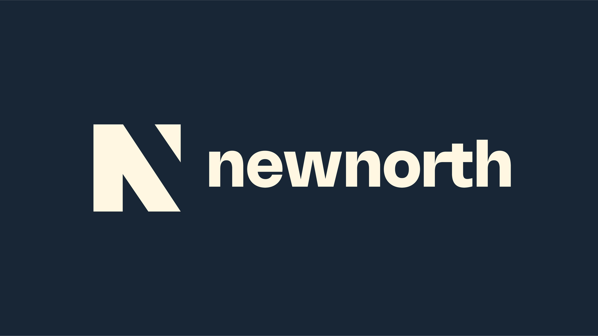
The ‘N’ device was crafted using two 'N's: one in solid color and the other formed by negative space. The top of the N is turned upwards as an aspirational arrow. The net effect is intriguing and balanced. The upward-turned top of the 'N' symbolizes aspiration and forward-thinking, aligning with New North's commitment to providing expert, proactive advice.
There was a gap in the market for a fresh and contemporary brand that would stand apart through it’s focus on connecting with their main audience. The imagery sets New North apart from competitors by focusing on the results and end benefits of its work. Instead of generic industry images or corporate scenes, the visuals depict new horizons, new paths, and new ways, emphasising the vastness of the sky and the possibilities New North explores.
Awards and recognition
SILVER - Better Future Sydney Design Awards 2024 -Identity and Branding, Corporate


