Moulis Legal
Discovering the design potential for a dynamic legal practice
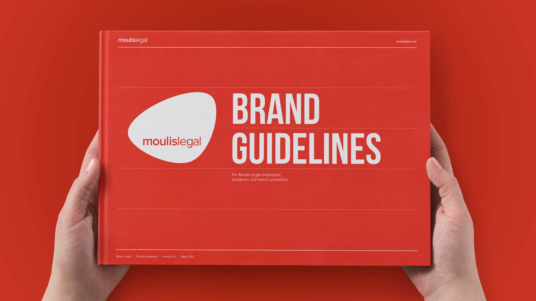
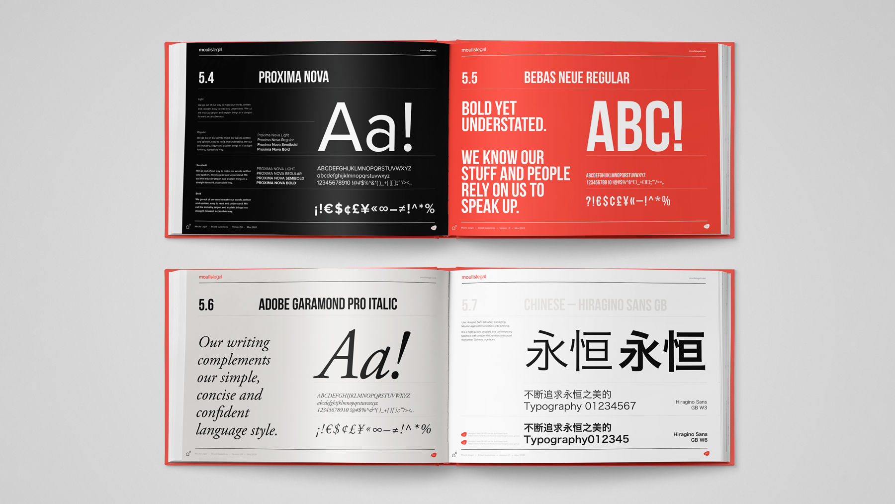
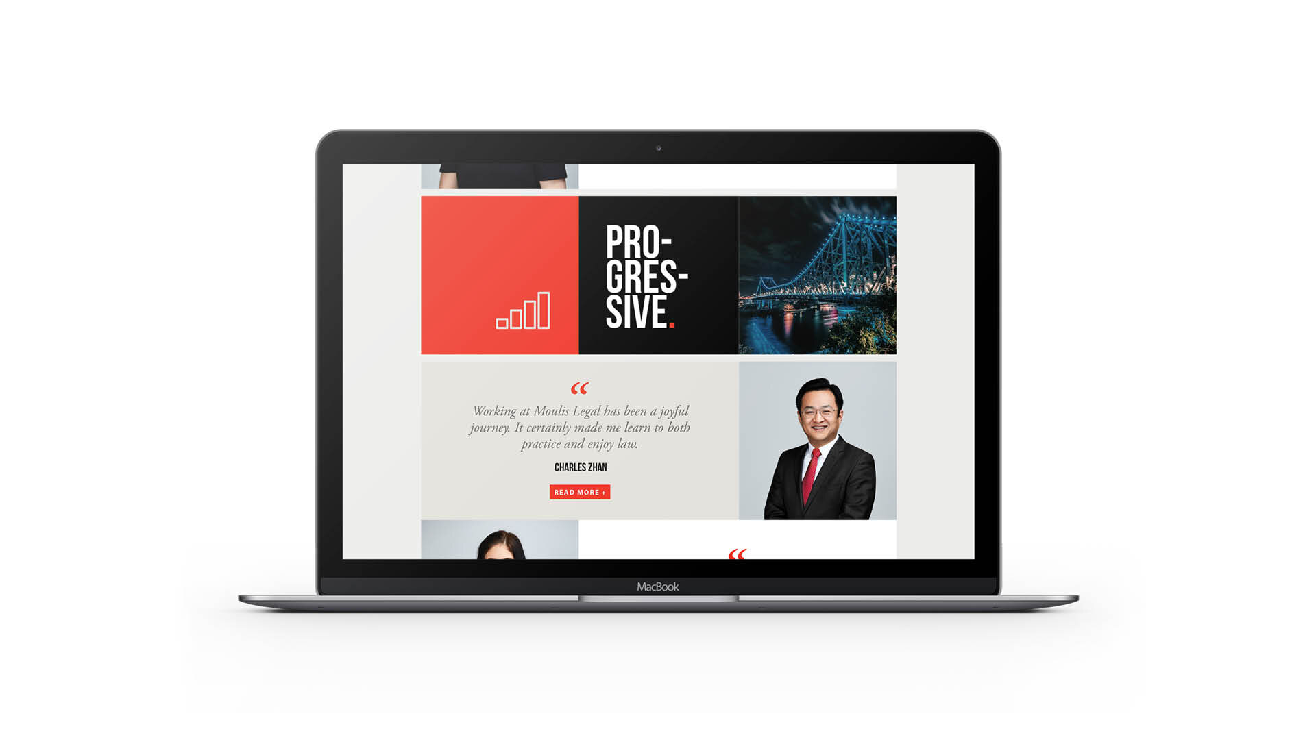
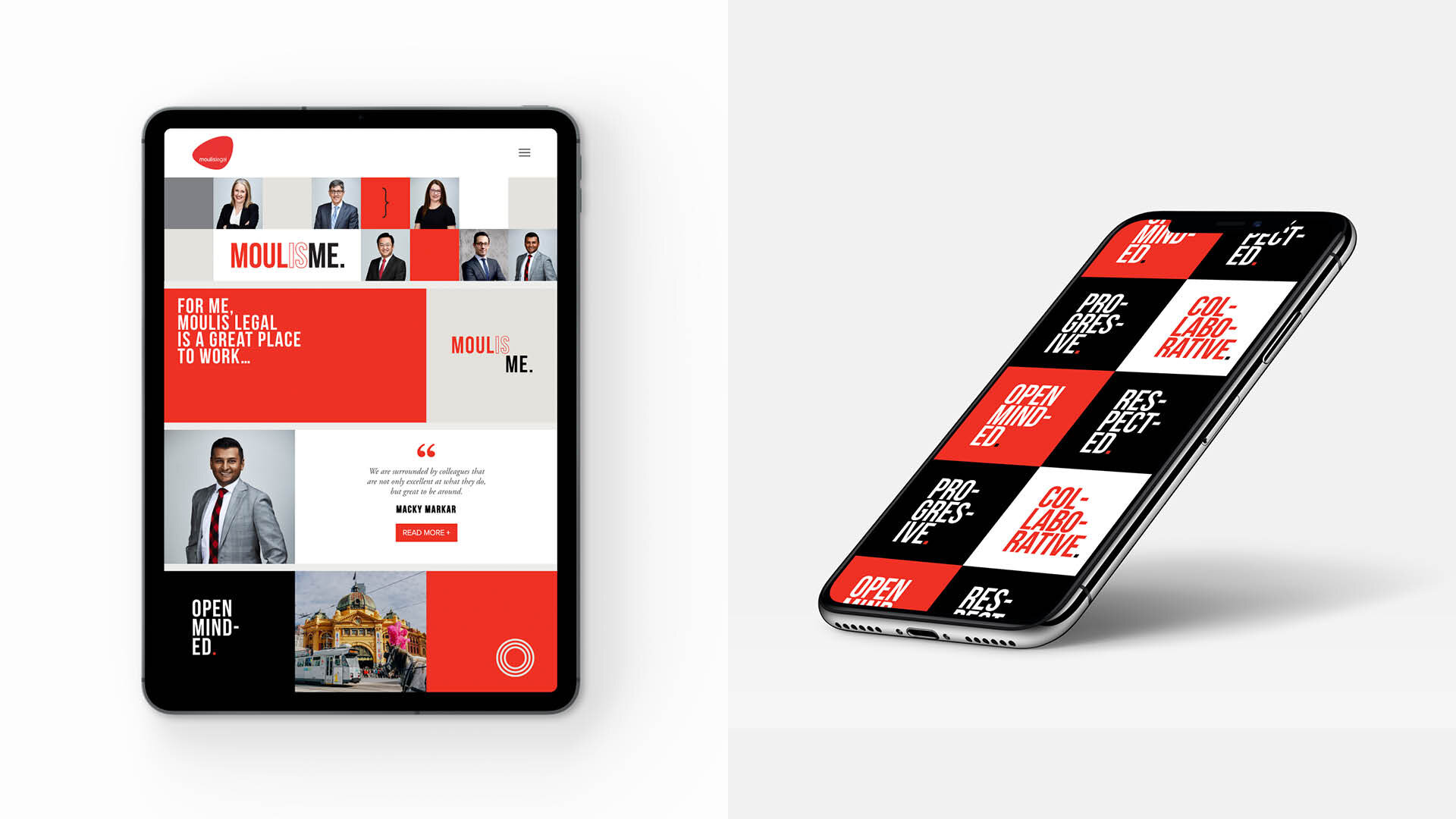
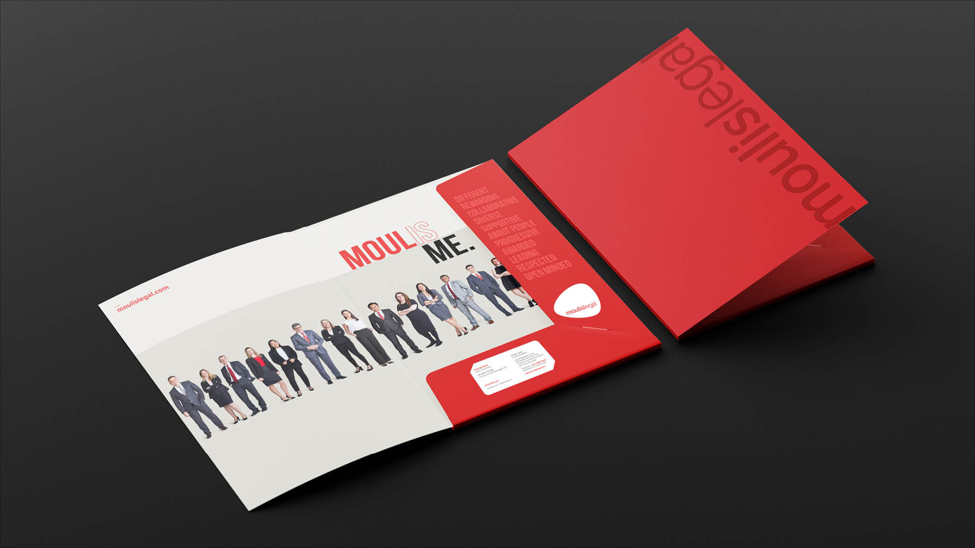
Moulis Legal engaged Creatik to redesign their marketing materials and document suite. The objective was to capture the full potential of their service offering as one of Australia’s most progressive and modern legal businesses, handling commercial and international matters.
Moulis Legal had an established logo with brand equity that they desired to maintain. The challenge was to lift the profile of the existing branded materials to align with the brand ethos and progressive ideaology of Moulis Legal. One key objective of the Moulis Recruitment Campaign was to position Moulis as an industry leader and attract new talent.
recruitment campaign, copywriting, conference branding, templates, brochures, art direction and design support
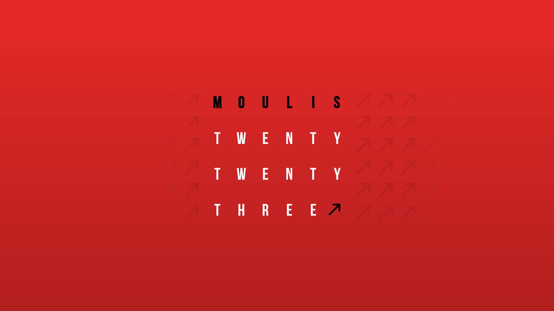
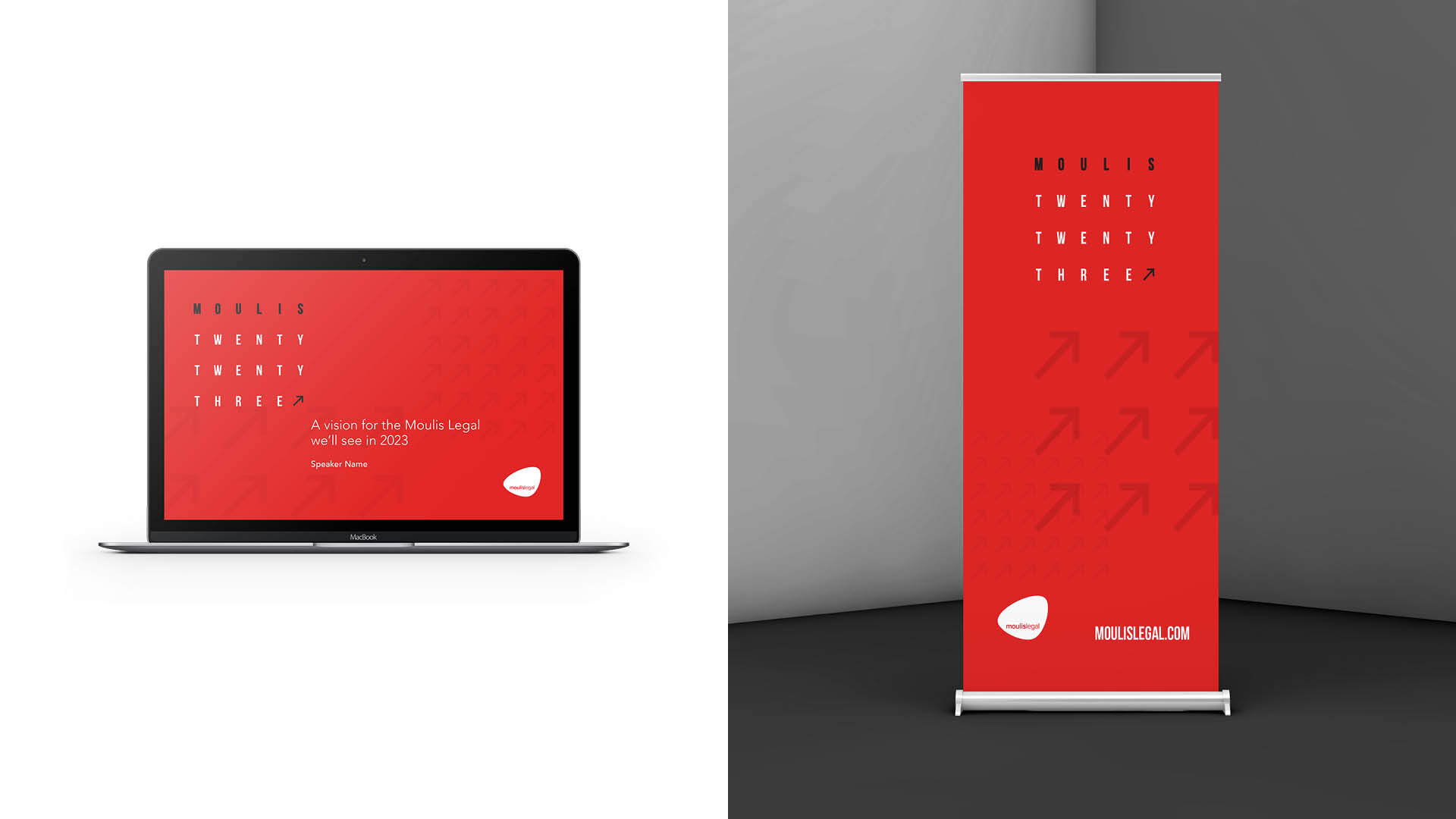
Moulis twenty twenty three
We worked closely with the leadership team at Moulis Legal to channel their vision for the team strategy conference.
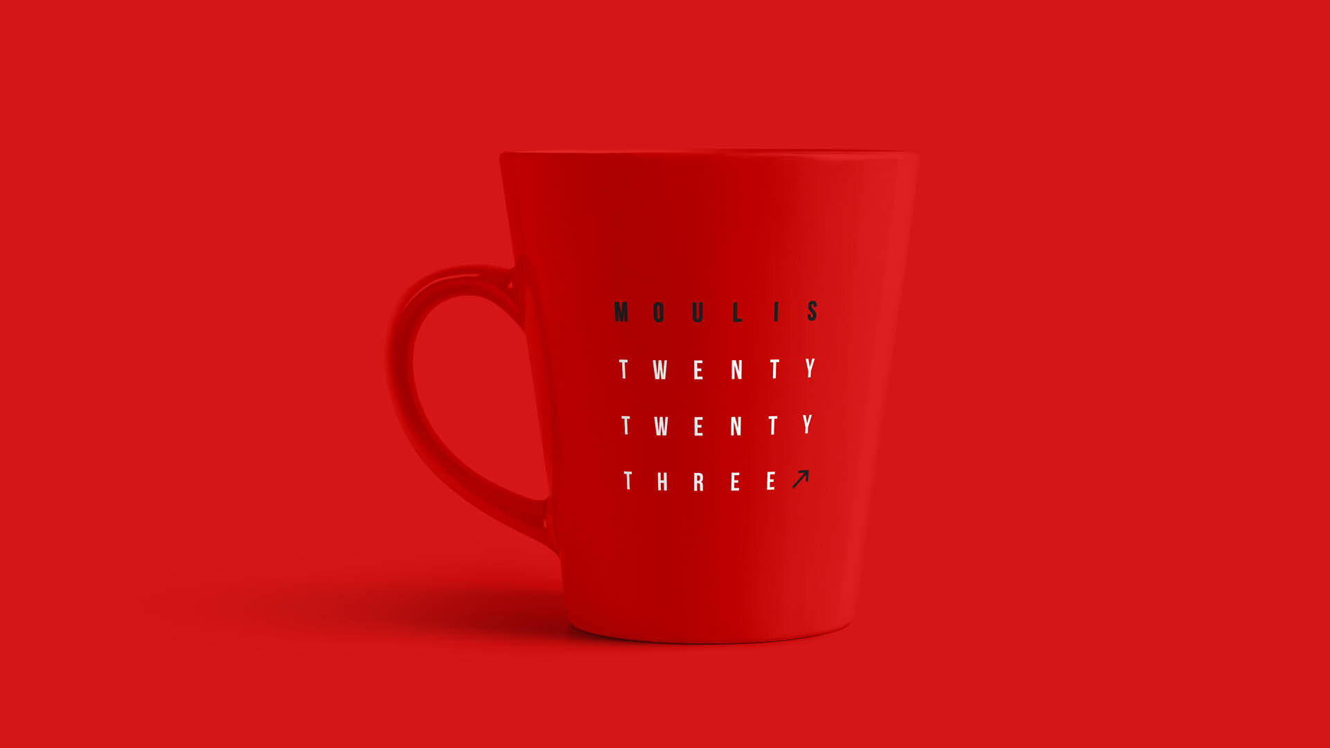
The event logo uses grid formation to widely space the wording MOULIS TWENTY TWENTY THREE. This arrangement provides structure, echoing the purpose of the conference. The arrangement is reminiscent of an eye chart – helping to compliment the ‘vision’ – whilst the arrow device provides direction, an upward trajectory for growth.


