Design Trends For 2019
by Lizzy Halyard
It’s February 2019, how did that happen?! We’ve chosen our favourite graphic design trends which we predict will be huge hits throughout this year.
With constant updates in graphics software and rendering technology, 2018 has seen huge leaps in the capabilities of graphic design, including through merging the worlds of graphic design, motion graphics and animation. Designers in 2019 will have so many possibilities and we find this so exciting!
GRADIENTS (AGAIN)
Gradients have been a consistent trend over the last couple of years, with big companies like Instagram and Spotify utilising them in their branding. Recently, gradients and colour transitions have become more common in logo design, as a way of providing a trendy and dynamic alternative to flat colours. By adding more colour-stop points to gradients (blending three or more colours instead of two) you can provide a smoother alternative. You can see how we’ve used a 3-stop gradient (Yellow, Green, Black) in our recent project for Cowyn Building Group.
Image credit: iPhone X landing page / Bruno Pego poster / Cowyn Building Group branding
3D ILLUSTRATIONS
The 3D trend has developed strongly over the last couple of years and will definitely continue to grow in 2019. Graphic designers can now create immersive 3D renderings which have amazing depth and texture. 3D illustrations are now being used by big brands to advertise products such as jewellery, sneakers, sports gear and more.
Image credit: HDRI Link Plugin promo / Casting (Couch) Potato render / Nike Free campaign render
Motion Graphics
In 2019 motion graphics will continue to be present in advertising campaigns. In today’s fast-paced and social media saturated world, companies need to engage audiences faster. Designers are finding more innovative ways of utilising gifs and making use of the looping feature on Instagram videos. Motion designers are increasingly catering to the need for short-length animations.
Image credit: Transparencies animation / 3D Motion teaser / Creepy Callies animation
Open Composition
Lately, designers have experimented with open layouts, which ditch a structured frame, and tap into the viewer’s imagination by making them feel like they are only seeing part of the whole picture. These compositions often lack a clear hierarchy and have a more chaotic feel, despite the fact that each element has been purposefully chosen and placed. A great example is our design for the New Payments Platform’s Annual Report.
Image credit: NPP annual report / Baugasm Series poster / National Park poster
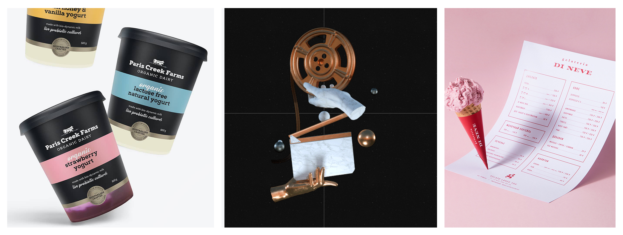
Anti-gravity
Graphic designers are now embracing the freedom of creating within a non-gravity digital environment. Floating objects create a futuristic and extraordinary visual experience to peak the viewer’s curiosity. We’ve utilised this trend in our recent Instagram post for our rebranding of Paris Creek Farms.
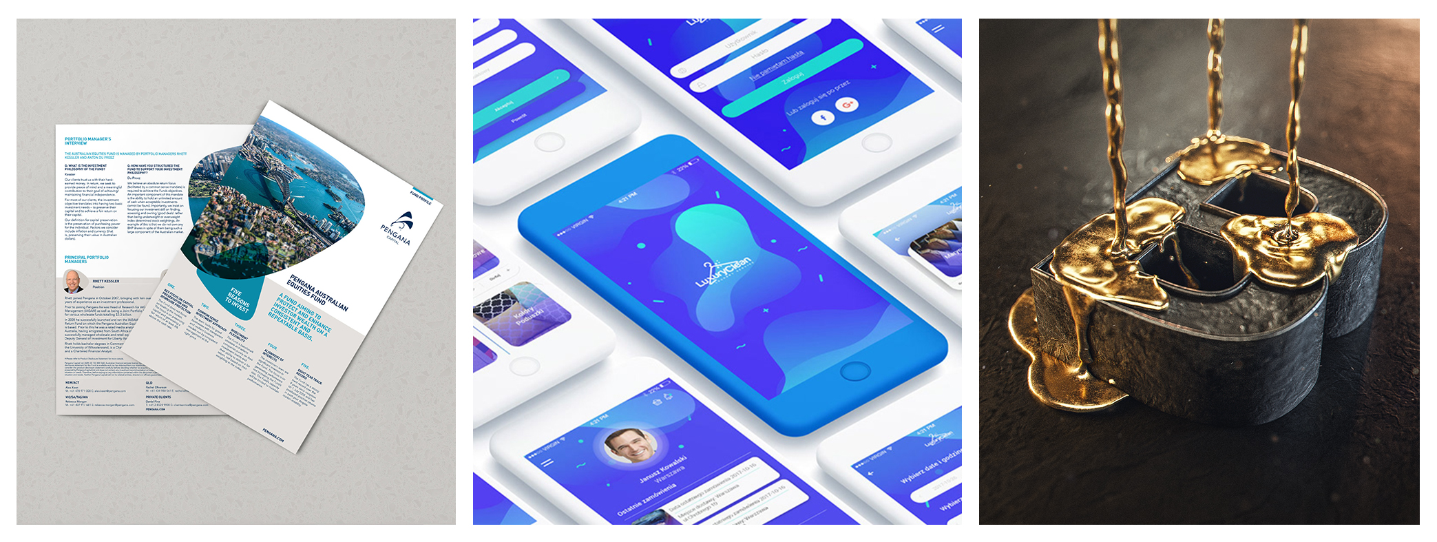
Fluid Shapes
The continuing presence of liquidised and fluid shapes, in both 3D and 2D, is another prediction we have for 2019. Liquid textures and shapes allow designers to create typography which can have varying thickness and an attractive kinetic feel. You can see how we’ve used pebble shapes in our brand identity design for Pengana Capital.
Image credit: Pengana Capital fund profile / LuxuryClean app design / Liquid Gold render
To sum up everything we’ve covered here, 2019 will be a combination of all things pretty and dreamy.
We’re looking forward to both embracing and challenging these trends.


