An all-access pass – building an accessible brand
Building an accessible brand shouldn’t be a buzzword; it's a strategic business decision. In a world where digital innovation is king and accessibility is often an afterthought, I want to provide some insights into why building a brand with accessibility in mind is crucial to your bottom line, explain how inclusive design can drive transformation and share four tips for improving your brand’s design accessibility .
First up, what is an accessible brand?
An accessible brand ensures its products, services, and communications are usable by everyone, including those with disabilities. It focuses on inclusive design, clear communication, digital accessibility, diverse representation, and responsive customer service, complying with relevant accessibility laws to create an inclusive experience for all customers.
Accessibility is often considered a matter of compliance, but the implications of being accessible are much more than ticking a box. By understanding the importance of accessibility and taking steps to address your brand's design standards, businesses can expand their customer base, grow revenue, enhance their brand reputation – and ultimately foster a more inclusive society. A no-regrets approach if you ask me.
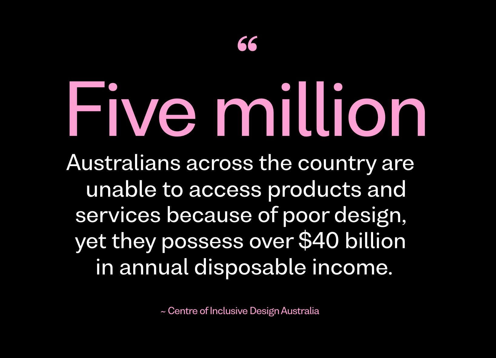
“Five million Australians across the country are unable to access products and services because of poor design, yet they possess over $40 billion in annual disposable income.” It is estimated 4.6 million Australians are living with disability, 3.6 million of these are invisible and not in plain sight. By designing products, services, and experiences without inclusion in mind, it is estimated businesses are only connecting with 80% of their intended target market and customer base.
So what’s the value inclusive design can bring?
In the financial services industry, it is estimated that there is an additional $1.5bn dollars in annual revenue to be gained, due to the 832,000 Australians that are currently financially excluded from services due to inaccessible design
The retail sector is missing out on an additional $4bn in revenue across household goods, clothing, footwear and personal accessories.
And an additional 228,000 tertiary qualifications could be earned with the full integration of inclusive design in higher education, resulting in an additional $4.5bn economic growth due to salary earnings.
Dr Manisha Amin, CEO of Centre for Inclusive Design, said, “Design that considers the full range of human diversity with respect to ability, language, culture, gender, age and other forms of human difference means more people are included. We commissioned the research (above) to identify and determine the necessary means by which Australia can act to reduce these gaps. Inclusively designed products and services that have edge users in mind, can reach and benefit up to four times the size of the intended audience and enable organisations to increase their revenue by growing the size of their target markets.”
Four tips for making your brand accessible
When we design with accessibility in mind, we're empowering individuals to independently engage with content and participate in the digital landscape. Inclusive design triggers innovation, opens new markets and creates richer engagement with customers. If you are wondering if your brand is accessible right now, here are 4 design centred considerations for you:
1. Is your brand toolkit accessible?
The science behind a first impression tells us it takes an average of 7 seconds for a customer to form an impression about your brand, and it takes 5-7 impressions for consumers to recognise your logo. Colour plays a significant role in accessible design, for brands who rely on colour to make a first impression; such as a logo, a headline, an infographic, a tagline, they need to consider if their colour combinations are accessible to people with vision deficiencies. Is there sufficient contrast between text and background colours, and are critical details of your brand recognition strategy readable for everyone. It's more common than you might think, Vision Australia estimates about 549,000 Australians (2.2% of the population) are colour blind – or have a colour vision deficiency.
A stocktake of your brand colours and how you are using them will quickly identify whether you are optimised for inclusion. Use tools like colour contrast checkers to verify that your colour combinations meet accessibility standards, such as those outlined in the Web Content Accessibility Guidelines (WCAG). When aiming for web accessibility, you should target the Web Content Accessibility Guidelines (WCAG) 2.1. There are three levels of conformance: A, AA, and AAA. For most practical purposes, achieving Level AA is the recommended goal.
2. Do you have alt text descriptors for images and graphics?
For brands led by powerful imagery and infographics read on. Data driven design is often missed by edge consumers because screen readers can’t follow the hierarchy structure of infographics from the back end of a screen reader because they don’t display chronologically. In the same way, imagery with overlayed design assets or filters are omitted from screen readers. When adding images, data sets and infographics to your website or document, always include alternative text (alt text). Alt text describes the content and function of images for those who cannot see them. Screen readers rely on alt text to convey the meaning of images to users with visual impairments. Pictures tell a thousand words, so use a few and be descriptive but concise in your alt text, accurately conveying the purpose and context of each image.
3. Is your content structured appropriately?
Implementing hierarchy sounds straight forward right? We see a lot of content, and achieving clear content structure is easier said than done. Engage a copywriter if you are unsure or need help to ensure logical reading order and proper document structure. Maintaining a logical reading order and structure within your content helps to facilitate navigation and comprehension. Use headings, subheadings, and lists to organize content hierarchically, allowing users to skim and navigate the document efficiently. Screen readers rely on this structural information to interpret and present content to users accurately. Consistency is key when it comes to document structure and accessibility. Properly structured content enhances accessibility and usability for all users, including those using assistive technologies.
4. Are you using accessible file formats?
Choose file formats that support accessibility features and are compatible with assistive technologies. PDF (Portable Document Format) is a common choice for sharing documents, but it's crucial to ensure that your PDFs are created with accessibility in mind. Utilize accessibility features in PDF creation software, such as Adobe Acrobat, to add alt text to images, create accessible forms, and enable text-to-speech functionality. Additionally, consider providing documents in alternative formats, such as HTML or plain text, to accommodate different user preferences and needs.
Achieving accessibility for your business and brand may seem huge mountain to climb, but small changes are better than none at all. Remember it’s not about ticking a box, it’s about positioning your business for growth, richer engagement, and the potential to engage meaningfully with new customers. According to Forbes: “While it may seem the ROI of design is hard to measure, while it's all too easy to see the costs involved to create it, consider the organic and far-reaching, positive effects. ‘Design-alert' businesses achieve a 125% return on their design-related investments.”
Future-Proofing Your Design
Accessibility is a strategic investment in the future. As technology continues to evolve, so do our expectations for experiences. By prioritizing accessibility from the get-go, we're future proofing our designs and ensuring they remain relevant and usable for years to come. The cost of retrofitting accessibility is estimated to be 10,000 times the cost of introducing inclusive design at the beginning. Yikes. Moreover, accessible design goes hand in hand with good design principles, such as clarity, simplicity, and user-centeredness. When we design with accessibility in mind, we're not just creating better experiences for those with diverse abilities, we're raising the bar for good design.
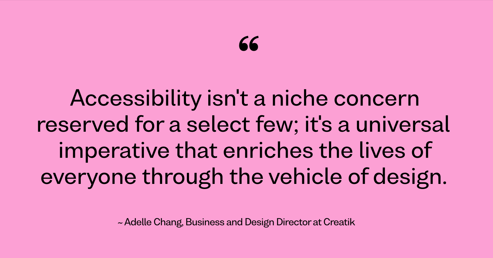
Accessibility isn't a niche concern reserved for a select few; it's a universal imperative that enriches the lives of everyone. Whether we're designing websites, PDFs, presentations, or printed materials, let's strive to break down barriers and create inclusive experiences that empower and embrace diversity. After all, in a world where connectivity is key, accessibility is the key that unlocks the door to a truly inclusive future.
Consider accessibility from the get-go with a little help from us.
Desmond Tutu said it best: You’ve got to eat that elephant one bite at a time. If the thought of making your brand truly accessible is daunting, let us help. Our team is trained and well-versed in creating accessible and inclusive design solutions that cater to and consider all users. We can offer guidance and suggestions across all platforms, including digital media, presentations, and print materials. After all, Every. Day. Design. Excellence is for everyone.
Adelle Chang
Business and Design Director
Adelle has 16 years experience in the creative services industry. Her hallmark is connecting brands and businesses with their creative potential and building strong, dependable, trusting client relationships.
Sources: To highlight the importance of inclusive design, the Centre for Inclusive Design partnered with Adobe and Microsoft to commission ‘The Benefit of Designing for Everyone’ report, which was conducted by PwC. Find the full report here.


