Creatik win 2 Gold and 2 Silver!
Congratulations to Marble Money and Zurich for taking home GOLD at the Better Future Sydney Design Awards 2024. With another incredible year for Creatik, New North and Alvarium also won Silver in hotly contested categories.
Winning design awards has a huge impact on both our team and our clients. For us, it’s a big boost—recognising the hard work and creativity we put in, and pushing us to keep innovating.
For our clients, it’s proof that we deliver top-quality work, reassuring them that they made the right choice in working with us. These awards strengthen our team, deepen client relationships, and help build a reputation that drives growth and success for everyone.
View the individual case studies via the links below.
GOLD, Marble Money
MARBLE MONEY / CREATIK DESIGN | GRAPHIC DESIGN - BRANDING AND IDENTITY, FINANCE
Remara, an Australian-based asset management company, was establishing a new business offering bridging loans. They had a great name, Marble Money, an ambitious business strategy, and were seeking a bold brand identity to launch their brand into the market. They approached Creatik to create this brand identity.
Click here for the full case study.
GOLD, Zurich Cost of Care Vol. 2
ZURICH / CREATIK DESIGN | GRAPHIC DESIGN - PUBLICATION
Since the original Cost of Care whitepaper released in 2018, the insurance landscape has changed significantly through regulatory reform, further advances in medical treatments, the rise of certain health events and changes in work. Likewise the technology of publication design has also advanced in this time. Adobe InDesign now has animation capabilities, allowing us to add interactivity and movement to PDF’s viewed online.
Click here for the full case study.
SILVER, Alvarium
ALVARIUM / CREATIK DESIGN | GRAPHIC DESIGN - BRANDING AND IDENTITY, PROPERTY SERVICES
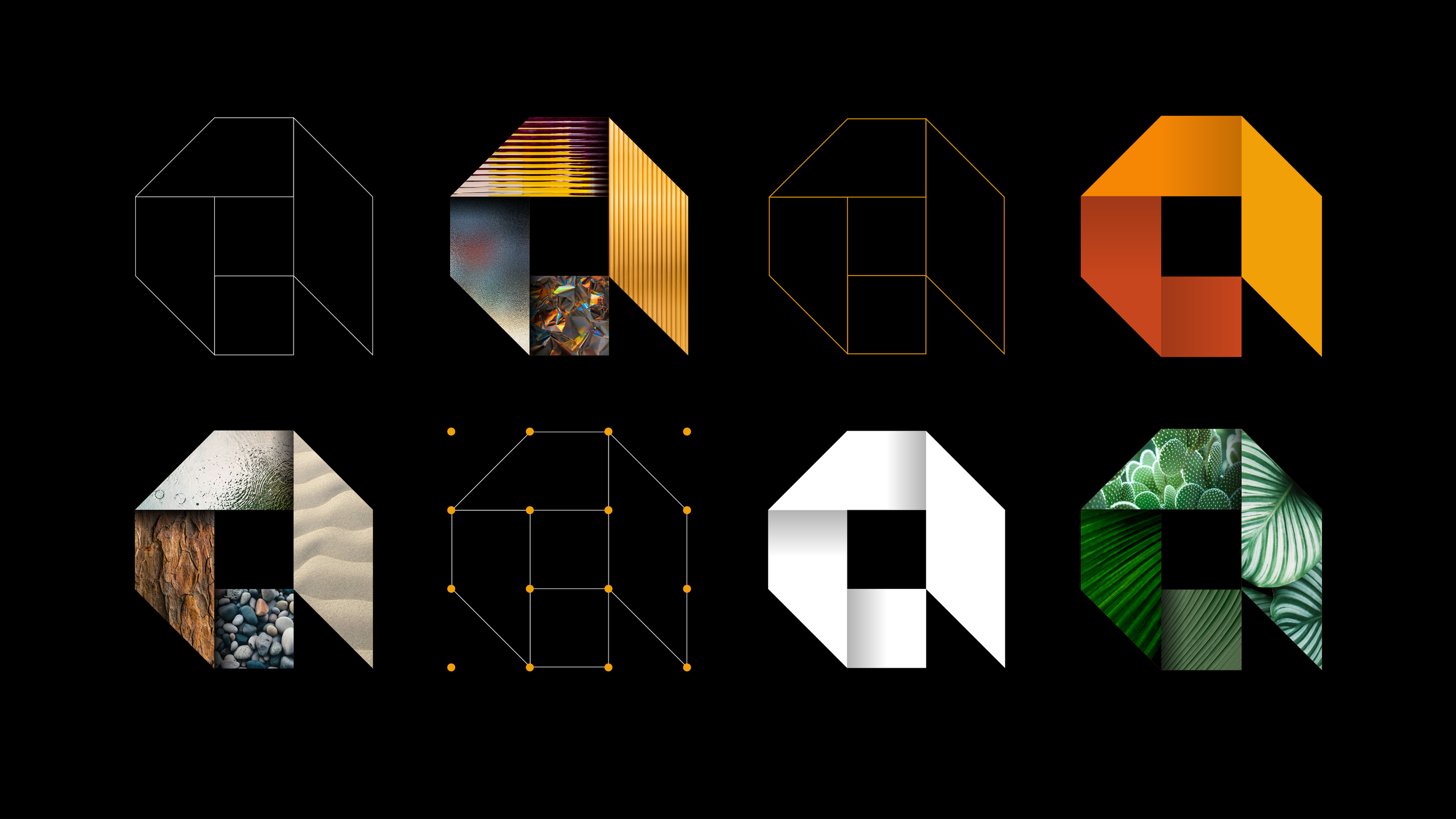
The idea for the new graphic device came from a stylised letter A – structured from 9 squares – representing planning and ideation of the built environment. The colour palette is a rich mix of warm orange hues tempered by charcoal black, grey and softer natural tones. The underlying structure and individual forms of the graphic device can be used as a flexible shape language to extend the brand across multiple assets.
Click here for the full case study.
SILVER, New North Insights
NEW NORTH / CREATIK DESIGN | GRAPHIC DESIGN - BRANDING AND IDENTITY, cORPORATE
The ‘N’ device was crafted using two 'N's: one in solid color and the other formed by negative space. The top of the N is turned upwards as an aspirational arrow. The net effect is intriguing and balanced. The upward-turned top of the 'N' symbolizes aspiration and forward-thinking, aligning with New North's commitment to providing expert, proactive advice.
Click here for the full case study.


